Hello
Some people need more silence. Some need less. I try to notice which.
UX design student with a background in game design and project management. A fixed approach gets you a fixed kind of answer. Adjusting to the person in front of you — pulling back for some, pushing gently for others — is usually the difference between hearing what someone thinks they should say and what they actually think.
Case studies
KI Innovations AB
Uncovering unmet needs through mixed-method research — and learning what it costs to fill a silence in an interview.
Titra Health was hoping to get KI Innovations on board as an investor, and wanted to understand what Sweden's ADHD medication titration process looks like for the people living through it. Not just clinically, but from the perspective of school staff, patients, and relatives. We did the generative research for Titra Health and presented it to both Titra Health and KI Innovations.
A big part of the work was the surveys. We made three separate ones, one for each target group, which meant wording every question neutrally so it didn't lead anyone and keeping each survey light and easy to answer. Together they got 69 responses, which we filtered before running a thematic analysis on the answers. I also planned and conducted two of the interviews myself and transcribed them. The themes from both became recommendations for each of the three target groups, and that was the part that mattered most. The personas were a smaller extra.
The clearest lesson came from the interviews themselves. I tend to fill silences, partly in case the question didn't land, but mostly because I want the person to feel safe and not awkward. The lesson was to let the pause happen, even if it feels a bit awkward. The interviewee often needs that time to put their thoughts in order and form an answer they're comfortable with. Then I make it feel safe by acknowledging their answer instead.
Title slide
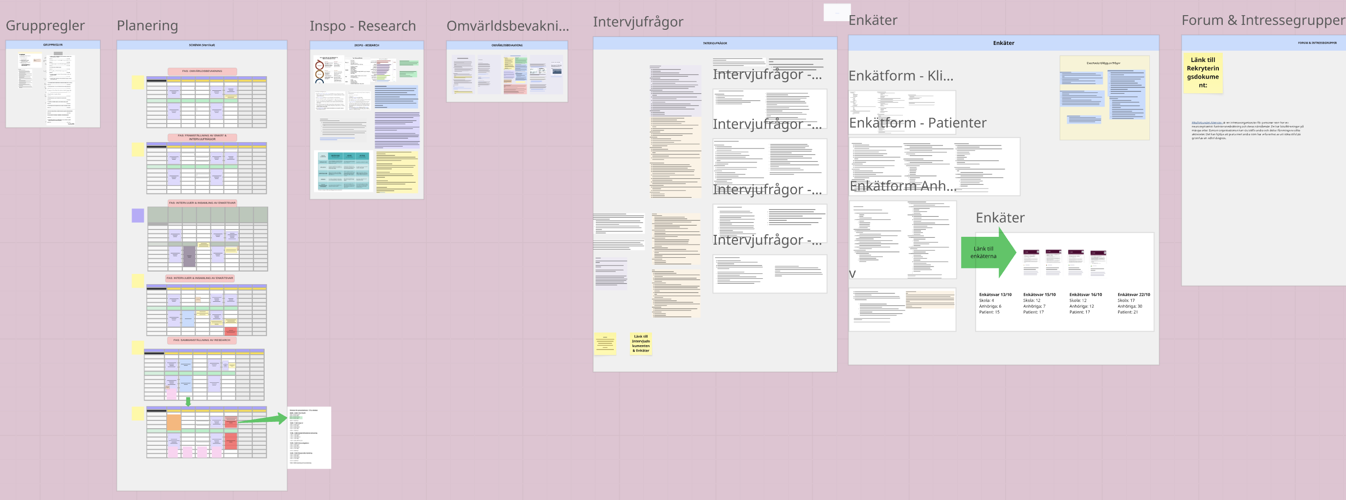
Planning & preparation (one frame)
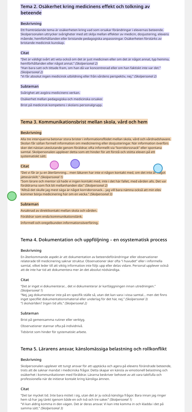
Analysis excerpt (school staff)
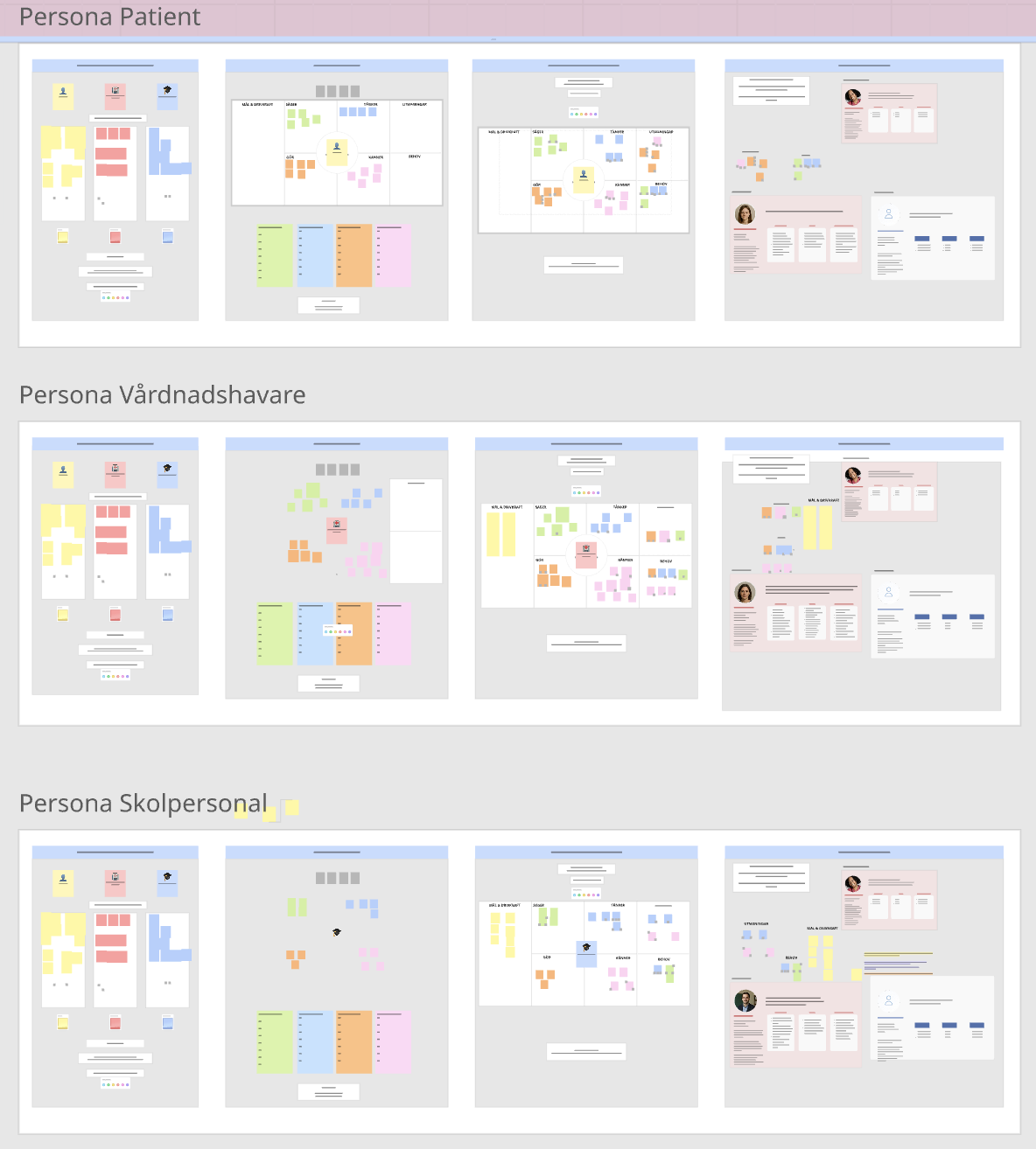
Persona work, all three groups
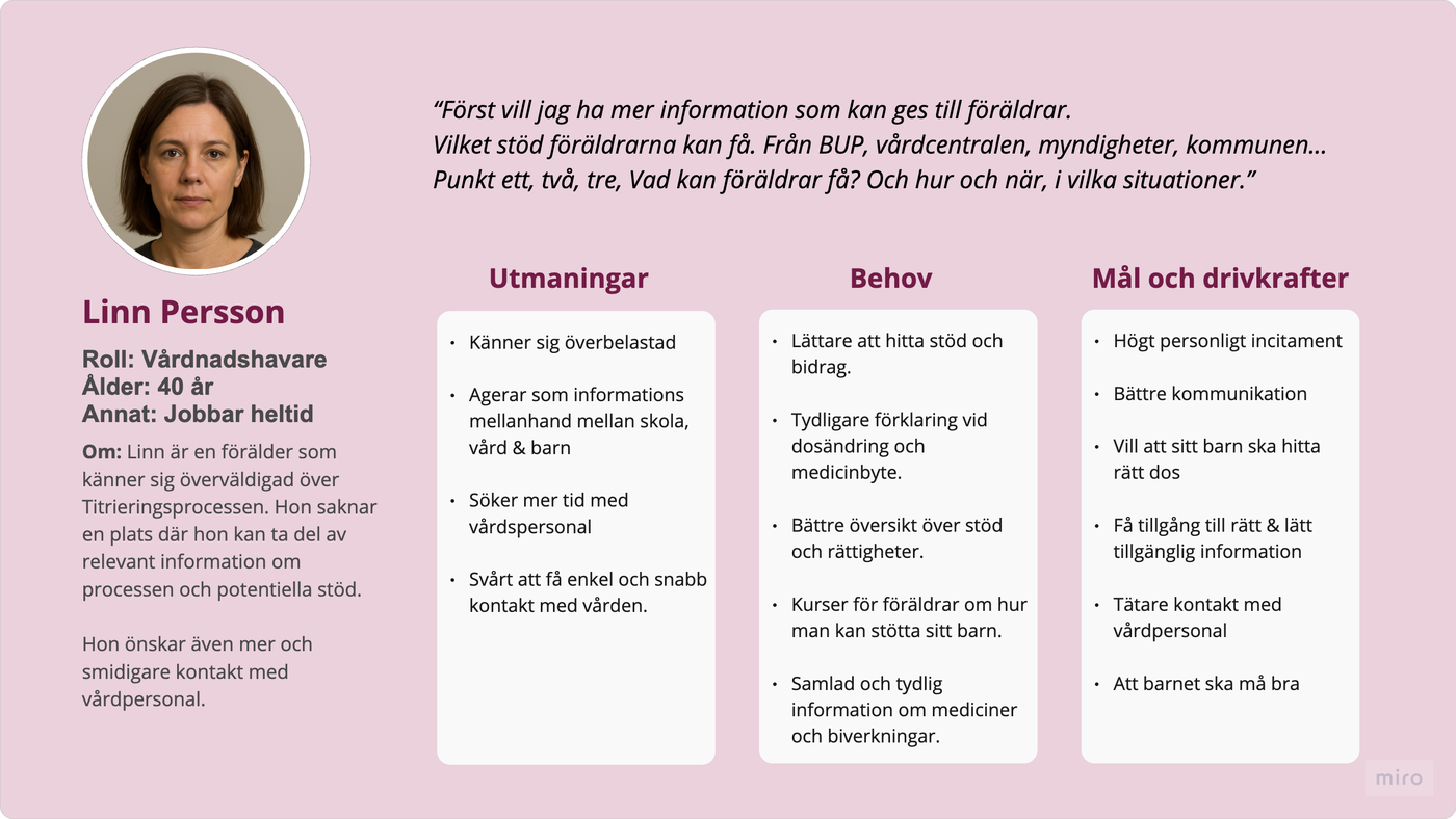
Finished persona (guardian)
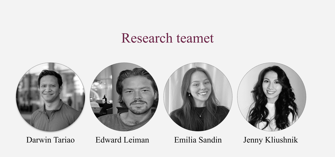
The team
LiveRN
Colors, type, components — the systems side of the work my other case studies don't really show.
My other case studies lean heavily on research: interviews, synthesis, stakeholder recommendations. I wasn't sure how much missing systems work would matter for an internship application, so I built a small app concept to find out: LiveRN, a live-status tracker for streamers, with its own components, color variables and text styles in Figma.
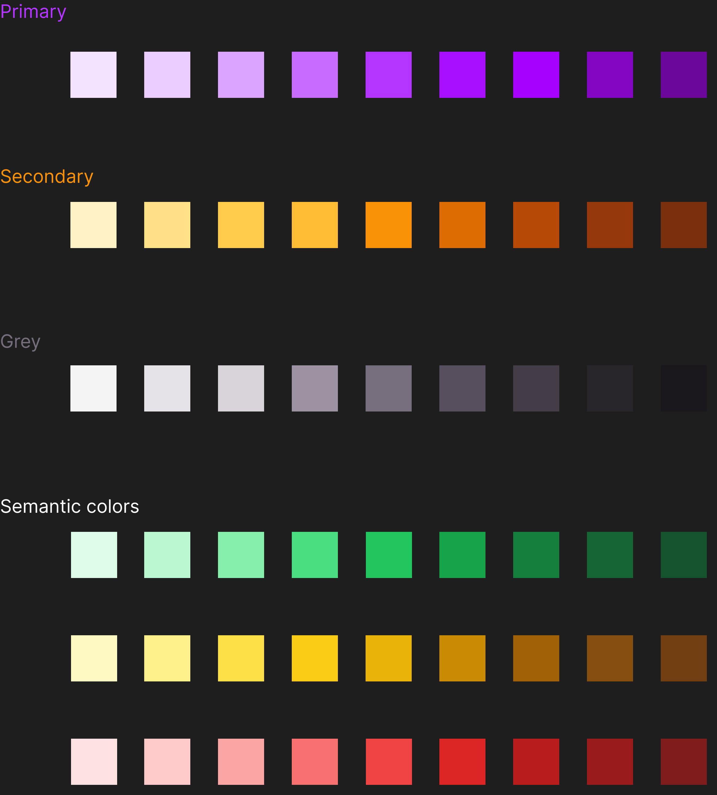
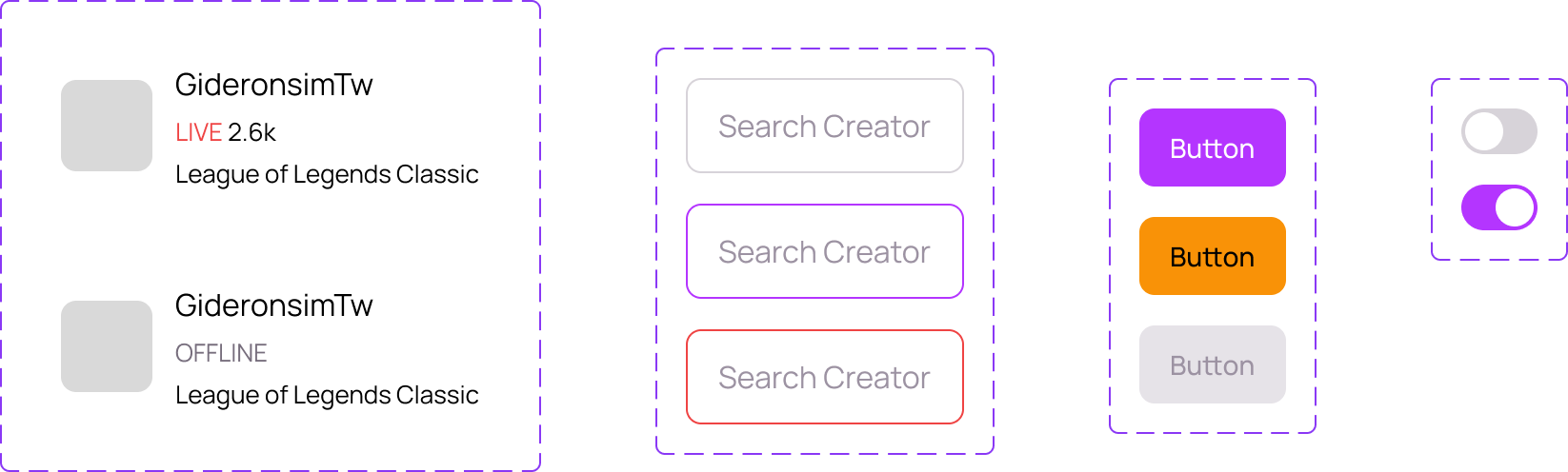
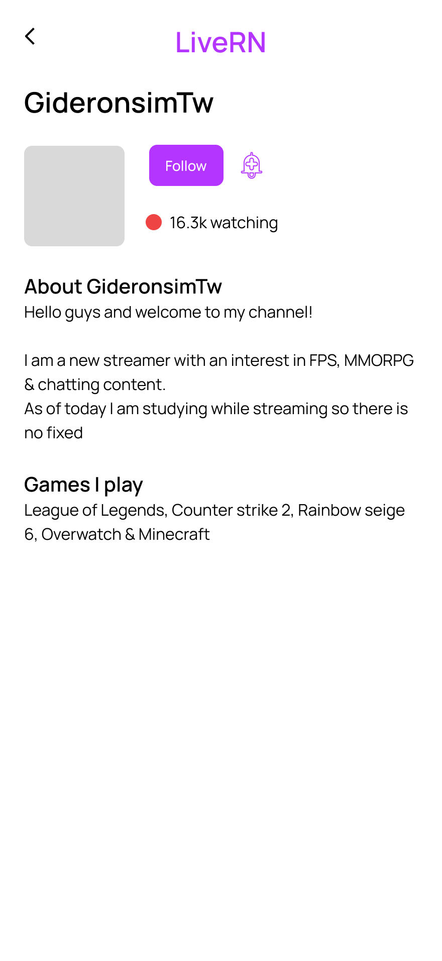
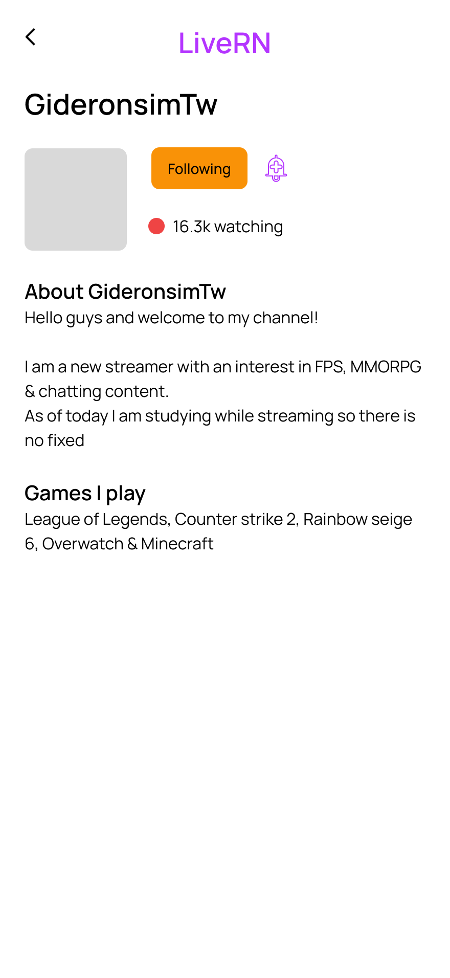
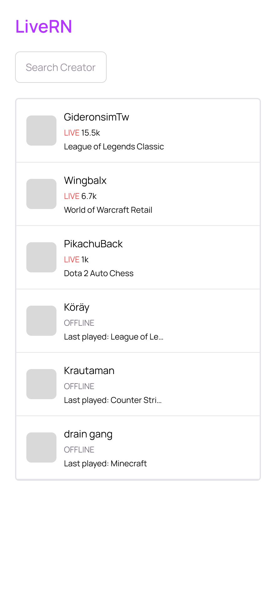
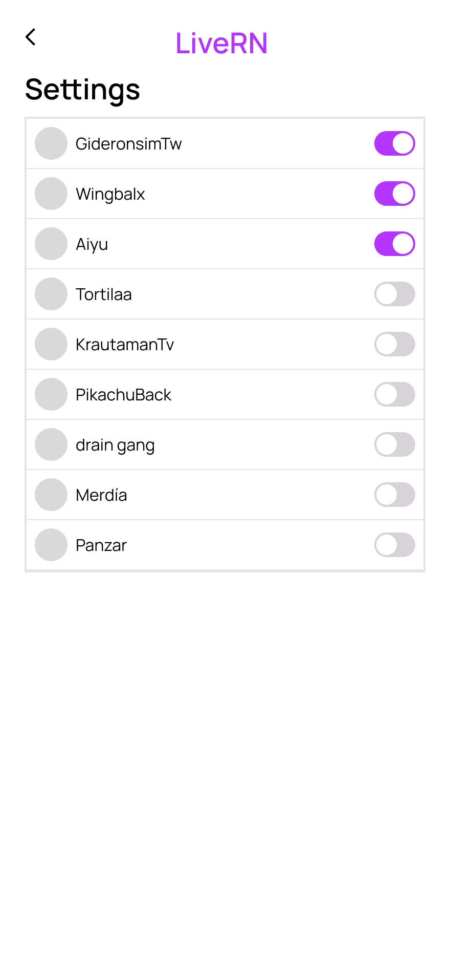
I built the system before touching a single screen. Colors first: a primary and secondary palette, a neutral gray scale tinted toward my primary hue for cohesion, and semantic colors for error, success, and warning states. Then type: a five-style scale, each with a defined job rather than picked by feel. Only then did I build components: a status row with Live/Offline variants, a button with Primary/Secondary/Disabled states, a search bar, and a toggle. Each one had real interactive states, not just static shapes. That became three screens: a home feed, a creator detail page, and settings.
The Follow/Following button: two states built from the same component, not a "disabled" look, because the action needed to stay reversible. A truncation fix on the games-played field, after I noticed long game names were breaking row height across the list. Small thing, but easy to miss if you're not actually testing with real content. Probably what matters most, though: every color, spacing, and type value in the file traces back to a defined system, not something I eyeballed.
Not following
Following
Home
Creator detail
Settings
Is there a real need here?
A strategic validation project for a quiz-hosting concept, built on netnography, AI-assisted filtering, and knowing when to stop trusting the AI.
Flatwave AB gave our class the brief. Our team chose to study pub quiz hosts, people who run quizzes weekly and professionally, with real stakes if a night falls flat. We used netnography, scraping and analyzing real Reddit discussions instead of relying on review data for existing quiz tools, since that data turned out to skew toward hobbyists rather than our actual segment. The question we were answering was blunt: is there a real enough gap here to justify building something, or not?
I led the AI-assisted filtering process, which narrowed roughly 700 scraped evidence points down to 33 across four iterations, and wrote up that section of the report. The part I'd flag: AI tends to agree with whatever framing you feed it, so I deliberately wrote prompts that invited pushback instead of confirmation, and ran a parallel manual pass to sanity-check what it surfaced.
Six people took part in our comprehension tests. Three said yes to our value proposition and three said no, and the surprise was who said yes. Hobbyist quiz-makers, an adjacent segment, responded differently than the pub quiz hosts we had targeted. The real differentiator turned out to be frequency and time pressure, not interest in quizzes. Nobody wanted pre-written questions handed to them. They wanted help writing their own creative questions faster, while still owning them. That gave us a new primary target group, so our recommendation to Flatwave AB was "Continue", with further research on this new group before building anything.
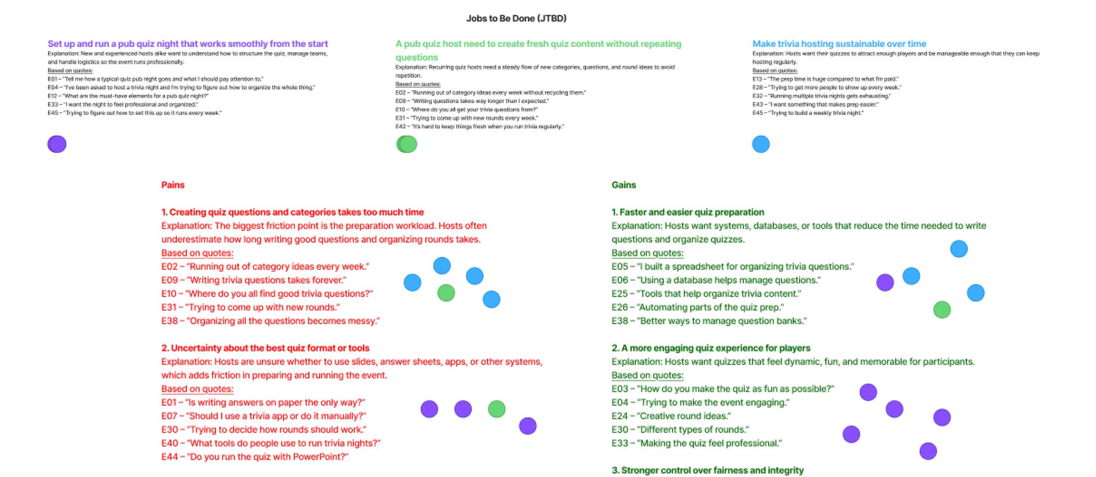
Jobs, pains & gains
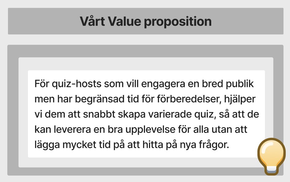
Value proposition · English translation inside
Wingspan's website, revisited
Heuristic evaluation, competitive analysis, and moderated usability testing — turned into five recommendations Wingspan acted on.
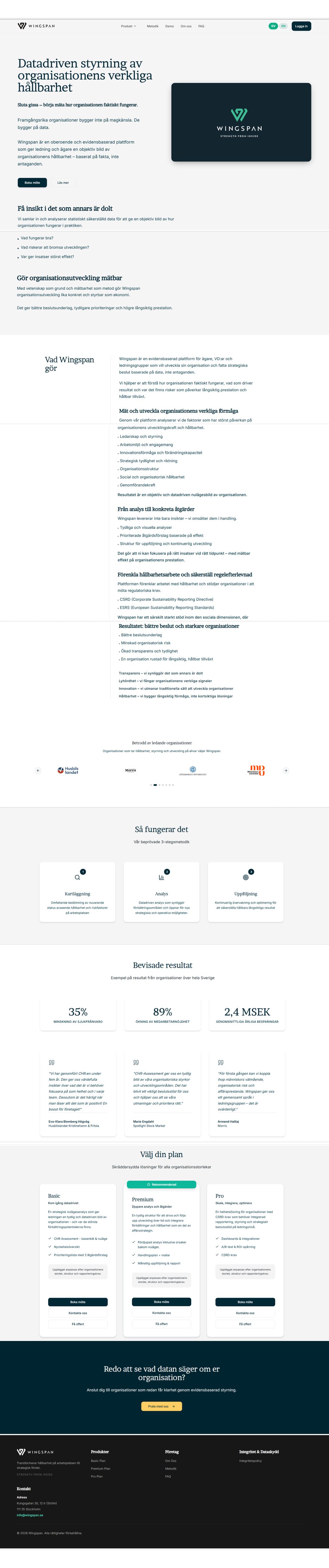
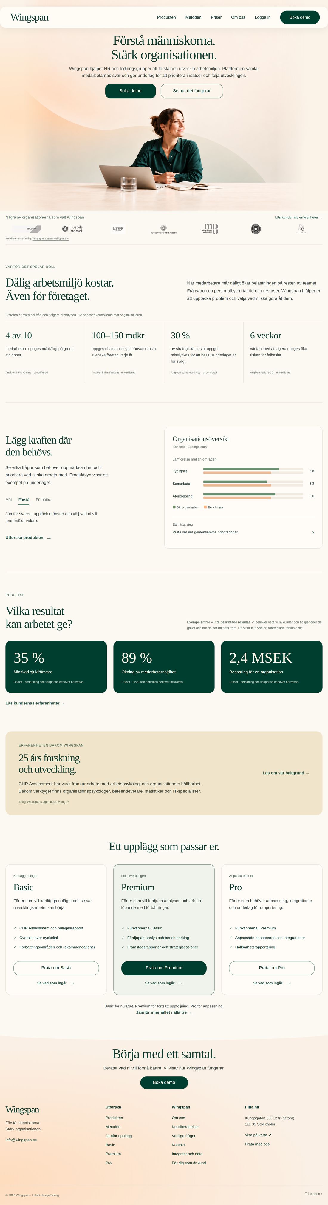
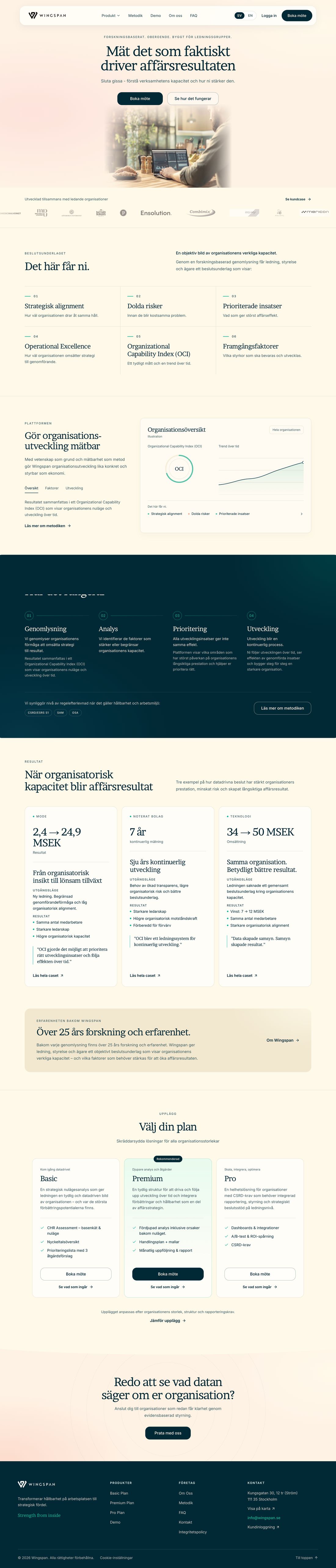
Wingspan, a B2B platform, had a website that wasn't converting the way they needed it to. An earlier, lighter evaluation happened as part of coursework. This case is about round two, which happened afterward, running parallel to school.
I led the moderated usability tests: I wrote the test script with three task scenarios, used the think-aloud protocol, and kept my mic muted while people worked through the tasks so I wasn't accidentally leading them. Alongside that, the team ran a heuristic evaluation against Nielsen's 10 usability heuristics, a competitive analysis (each of us analyzed one competitor), a survey, and a card sort, before we synthesized the findings through affinity mapping and thematic analysis.
That synthesis became five priority recommendations, mapped on an impact/effort matrix so Wingspan could see what was worth doing first.
The part I'm proudest of shows on their live site. The old homepage leaned on headline numbers and short quotes, and we argued that figures alone don't earn trust: for the social proof to work, visitors need real customer case studies they can dig into before they believe the numbers. Wingspan's launched homepage now leads its results section with customer case studies, each with a starting point, results, and a quote, plus a link to the full story.
Region Gotland
Designing with real stakeholders and playtesting with students aged 10–18 to tackle an engagement problem.
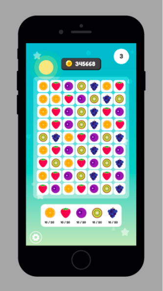
During my third year in Game Design, I was project manager and game designer in a team of three, on a project commissioned by Region Gotland. The goal was to develop an app that combined surveys with engaging mini-games to better understand students' aspirations and address low interest in higher education.
Before designing anything, Region Gotland's head of education briefed us on why the project mattered. After that we had regular stakeholder meetings with her and the region's project leader. It was also the first project we'd had with a real budget, so the scope had to fit it. We playtested in classrooms with students aged 10–18. The final product let administrators create surveys, followed by a rotating "mini-game of the month" to keep students coming back. Due to time constraints, the games were inspired by existing successful concepts, with original art and gameplay tweaks.
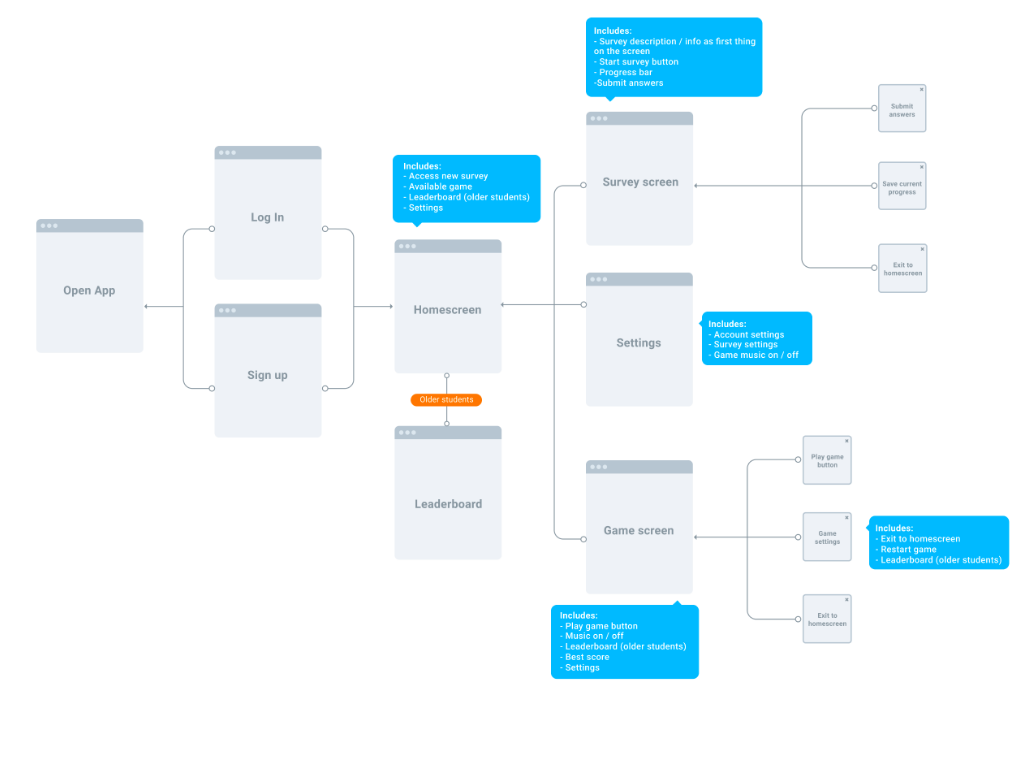
Student flow
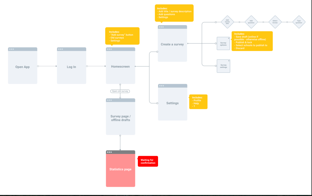
Admin flow
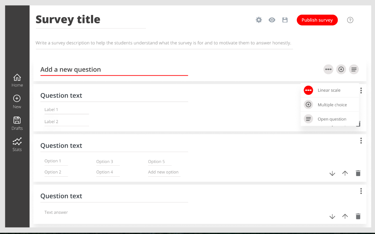
Survey builder
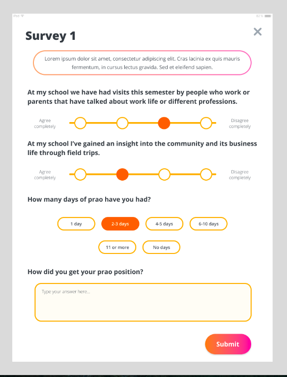
Survey (student view)
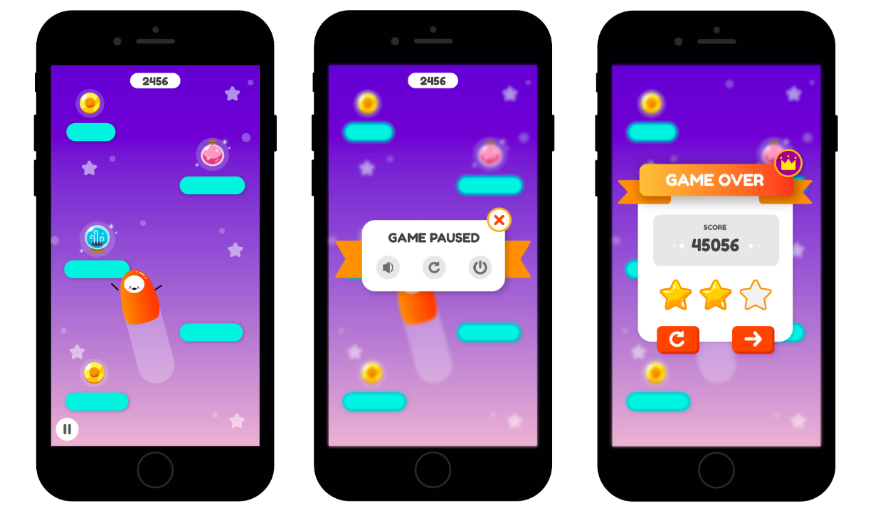
Game 1
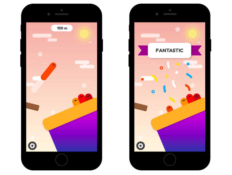
Game 2
Game 3
The two user flows above are what I'd point at. I mapped the app screen by screen for each role, a student answering a survey and an administrator building one, and noted what had to be on every screen. With a real budget to fit, those flows were also how we argued over the backlog: what shipped, what waited, what got cut.
One thing in scope was a high-score list for each game. We ran out of time and budget before building it, and looking back I'm not sure it belonged. In an app meant to get students to answer surveys properly, it pulls attention toward the game and away from the questions, so I'd want to test that before building it.
None of this was called UX at the time — it was a game design degree — but user flows, a prioritized backlog and testing with real users are the core of UX work.
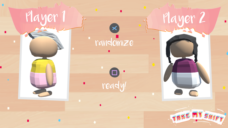
Take My Shift
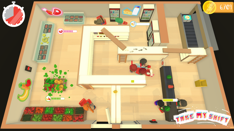
Two employees, one understaffed supermarket, and a shift that spirals fast.
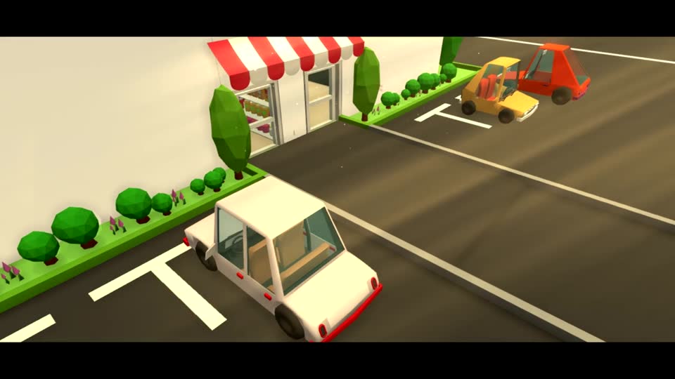
It's Monday morning. You and your co-worker walk into work at the local supermarket and quickly realize you're alone — a call to the manager confirms everyone else is sick. It's up to the two of you to run the entire store by yourselves. Getting fired is not an option. What could possibly go wrong?
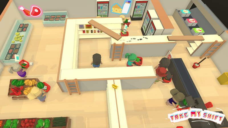
This was one of my earlier projects, from a few years back, and my role was split between project management and design. We worked in Scrum, and I planned our daily stand-ups, sprint planning and sprint reviews, managed the backlog in Trello, and helped source sound design. Most of my time went into playtesting, and that's where the design side came in: running the game myself and with others to find where the mechanics needed tightening, and catching bugs along the way.
My goal was to make the game feel as good as possible while staying accessible to casual players, our target audience. That meant deliberately playtesting as a casual player would, which got harder the better I got at my own game. Most of what came out of that work were concrete design recommendations, each one built on spotting where the game's difficulty or feel didn't hold up for someone playing casually.
Recognition
18,000+
downloads of my published thesis on toxicity across League of Legends ranks.
Read the thesis on DiVA ↗"Take My Shift" — recognized with Best Presentation plus three more nominations.
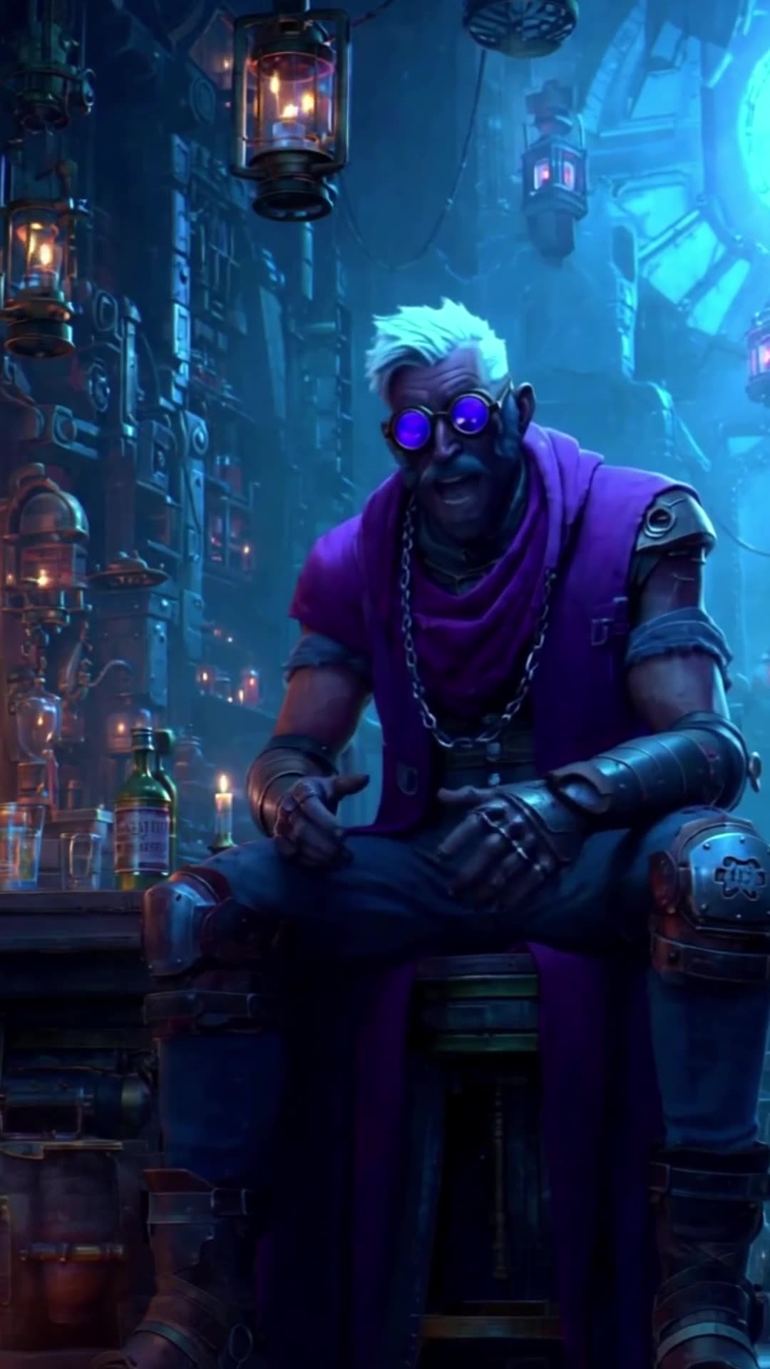
Outside of UX, I co-created fantasy short stories with a friend for our own YouTube channel. Three shorts below.


Get in touch
Looking for a UX intern?
I'd love to hear from you. Send me an email or find me on LinkedIn.